
Creamy
An e-commerce redesign UX case study
“Creamy” is an e-commerce website owned by an artist who specializes in designing fake food and turning them into wearable accessories. I was tasked with creating a redesign to improve usability.
Role:
Solo
Tools:
Figma
Photoshop
Date:
February - March 2024
Duration:
2.5 weeks
Plan
Define a clear target: What problems do users identify with Creamy’s current site, and what do users expect when shopping online?
Understand Creamy’s target audience and their pain points as well as their needs
Analyze existing e-commerce sites that sell similar products and learn about their current features
Align business with user needs, and design a solution that makes both sides beneficial
Users
With a clearer plan, let’s get to know the users.
Who is Creamy’s target audience?
What influences users to ultimately choose a product to buy?
What makes users happy, and what frustrates them?
With this in mind, I hosted a survey with 26 participants and interviewed 4 people who have an interest in Japanese fashion or cosplay. Afterward, I collected the data on sticky notes and created an affinity map.
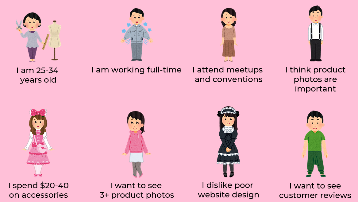
Key quotes directly from users:
I’m willing to spend more money on accessories that are high quality, handmade, and unique.
It’s frustrating when there aren’t enough product photos so I can see items from different angles or see how they’re worn.
I usually close my tab (of a website) if it has poor design. I’ll give up if I can’t find items easily.
Usability of current site
I conducted usability tests on Creamy’s current site with four people.

Pain points:
Background is too busy
No product categories or search function
Endless scrolling is not favored
Too many Sold Out listings (Creamy’s artist creates new listings each time they remake a design instead of updating an existing listing)
Gain points:
Number of product images (3+)
Current checkout process is easy
Detailed product descriptions
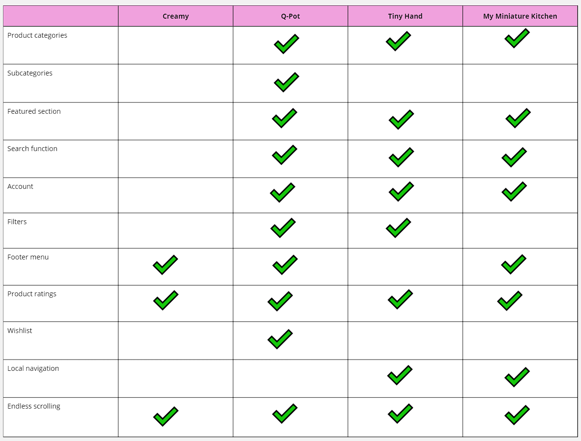
C&C Analysis
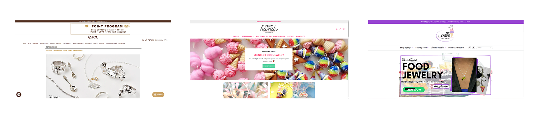
First, I analyzed Creamy’s possible competitors: websites that are also known for food-themed accessories.
Creamy is missing a lot of foundational features found on the competitor sites, including product categories, local navigation, a featured section, a search function, a user account, and filters.
I also did an analysis of clothing sites that interviewees mentioned as favorite sites to shop.
These websites have features that were also found in competitor sites. Their Home pages have sections such as “New Arrivals” and “Featured”, while Creamy’s site lists all products directly on the Home page, due to the lack of product categories.
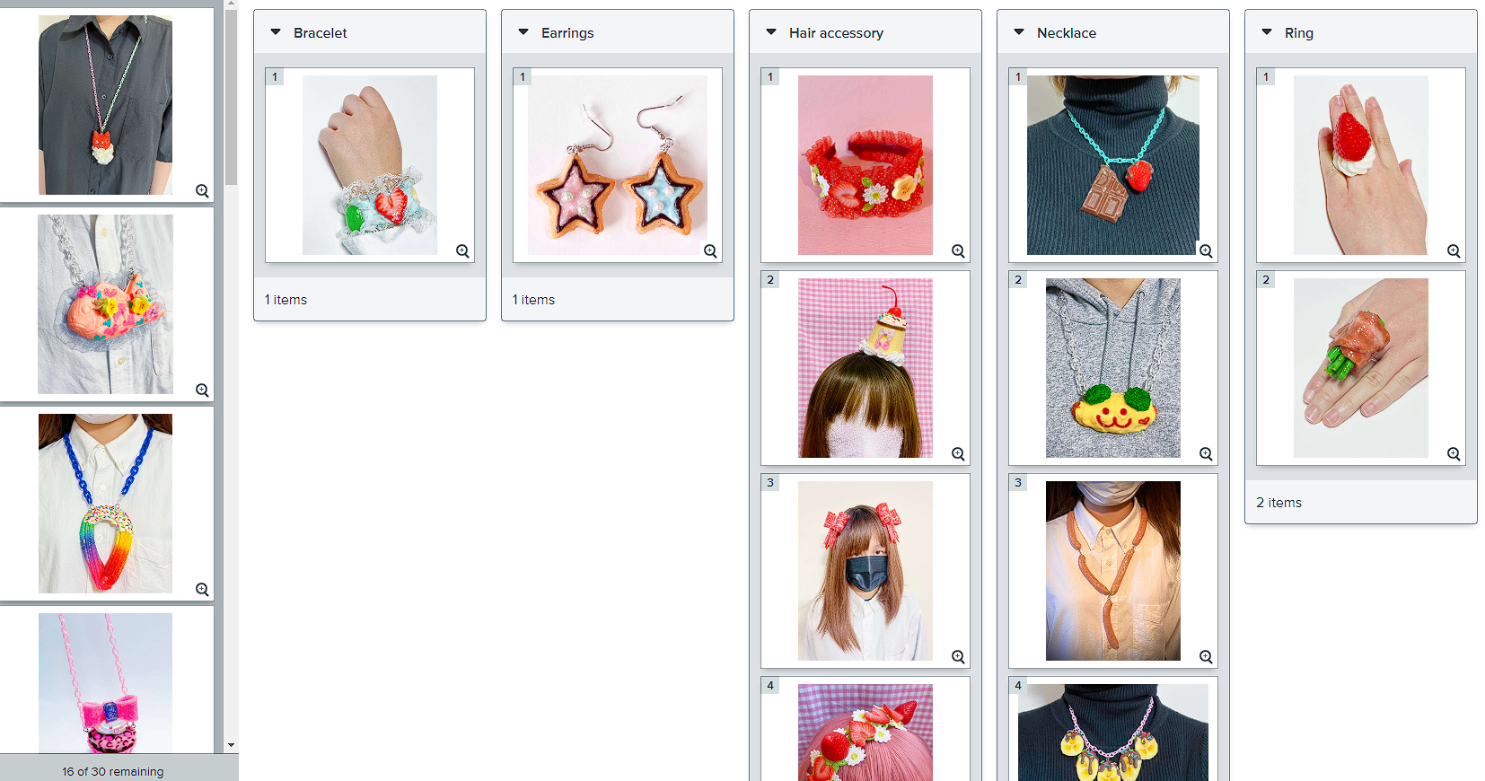
Card Sorting
I hosted an online hybrid card sorting with 22 participants. I used 30 of Creamy’s product photos and asked users to place them in categories I provided, with the option to create categories if they felt that the ones I provided were not suitable.
The vast majority of users were able to intuitively categorize the images into the categories I provided. There was one image of a headband that was often misclassify as a bracelet, which signified that I would need to choose a different main product photo.
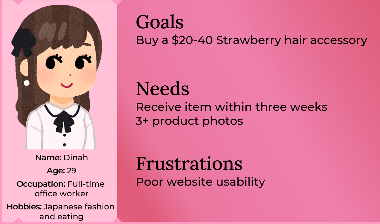
Persona
Meet Dinah, a 29-year-old full-time office worker who enjoys Japanese fashion. She wants to buy a hair accessory from Creamy that matches her strawberry-themed outfit to an upcoming event. She wishes Creamy’s site was easier to navigate because of its busy background and lack of product categories.
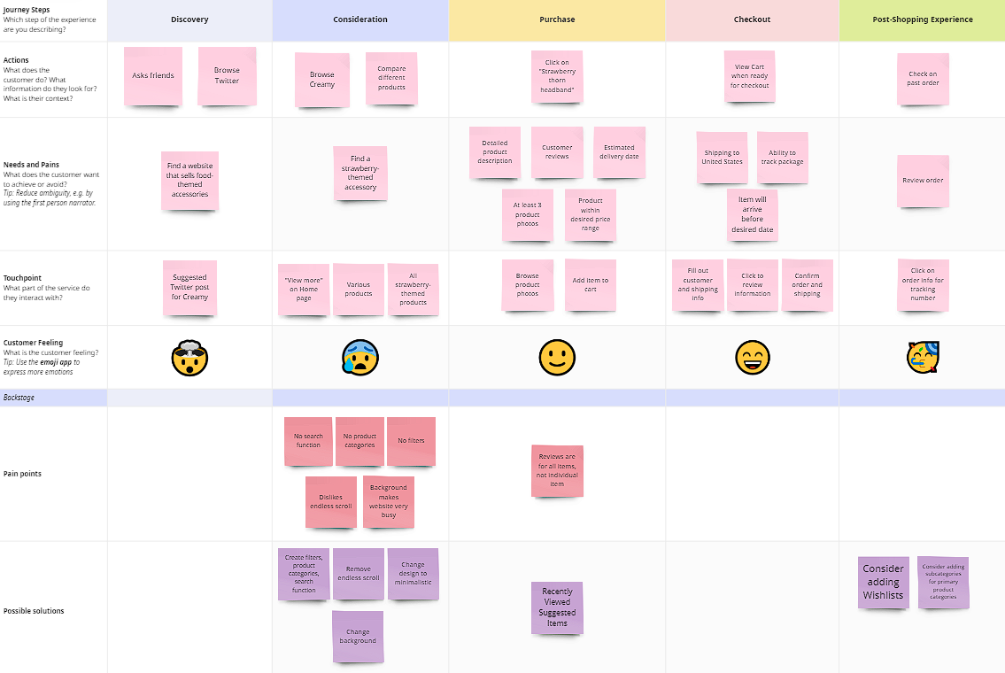
Journey Map
I made a retrospective Journey Map based on Dinah’s experience with Creamy’s current site. She experiences the most frustrations during her browsing and consideration phase.
Site Map
With my above research as well as knowledge about Creamy’s business practices, I created this Site Map.

I added the following links in the global navigation:
Products: You can view all products on a separate link instead of the Home page, and products also have been categorized
Gallery: Users can view Creamy’s retired designs and consider requesting custom orders instead of having the product pages clogged with several sold out listings
I also added a user account page.
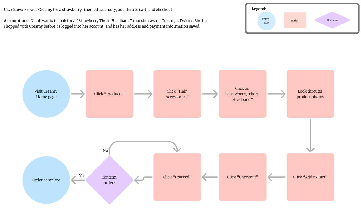
User Flow
Let’s assume that Dinah wants to look for a “Strawberry Thorn Headband” that she saw on Creamy’s Twitter. She has shopped with Creamy before, is logged into her account, and has her address and payment information saved.
This illustrates a most linear flow for Dinah’s Happy Path.
Design
After sketching, I designed my lo-fi wireframes.
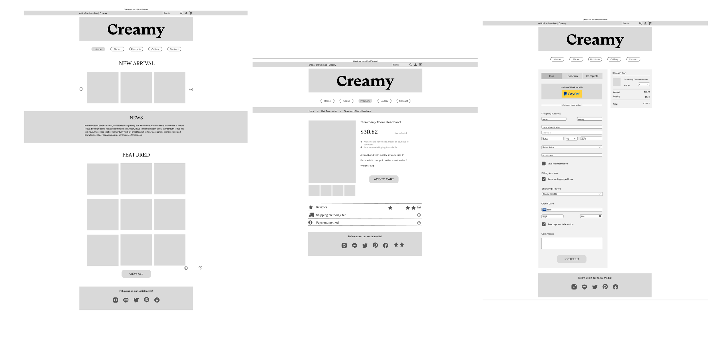
At this stage, my design choices included:
Minimalistic design: to allow Creamy’s colorful products stand out on their own and so users won’t get distracted by a busy background clashing with the products
Removal of endless scrolling: research showed that the vast majority of users dislike endless scrolling so that they may be able to easily pick up from where they left off of browsing
New Arrivals carousel and Featured section on the Home page
Breadcrumbs
Search function
Typography: I chose three fonts (excluding the logo’s font) with average contrast primarily for accessibility
Layout: I considered this layout to be optimal for mobile as well
Ability to enlarge product photos
Usability Test
I conducted a usability test on my lo-fi prototype and asked 3 users to replicate Dinah’s Happy Path.
All users were able to complete the task by the benchmark time.

Shopping with Creamy
With the suggestions made by users, I implemented the following:
Pop-up “added to cart” confirmation: Creamy’s current site automatically redirects users to the checkout process after adding an item to their cart. With this pop-up, this can allow users to continue shopping or proceed to checkout
“Recently Viewed” and “Suggested Items” on Product Page

The key feature I wanted to highlight with these additions, as well as on the order confirmation page, is the continual suggestion of other items to help users stay on the website and shop for as long as possible.
Test out my hi-fi prototype here!
Next Steps
Because of the time constraints, I wasn’t able to implement every feature I had planned. For future designers and developers, I strongly recommend:
Continue usability testing on the prototype for more feedback and possible improvements
Add submenu to product categories (e.g. hair clips and headbands under Hair Accessories)
Implement wishlists
Add product name and price to product preview: Creamy’s current site shows the product name and price when you hover over the product thumbnail, which received positive feedback during usability testing on the current site, but I wasn’t able to simulate this feature in Figma yet!
Thank you for taking the time to review my UX case study. I hope it has provided valuable insights and showcased my approach to problem-solving. If you have any thoughts, questions, or suggestions, I would be thrilled to connect with through e-mail or LinkedIn!